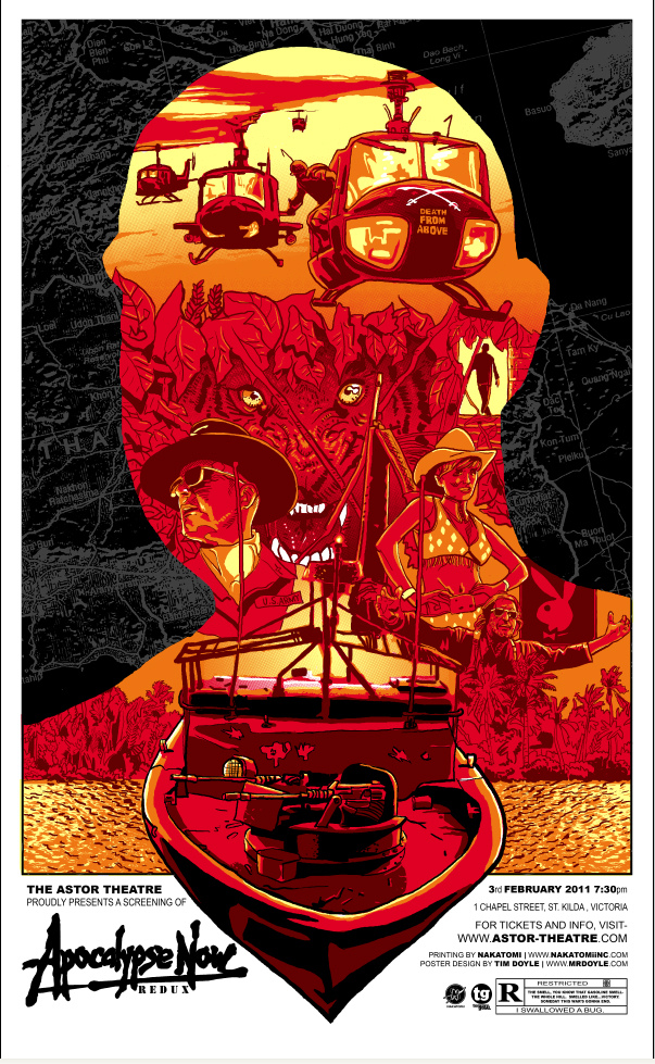
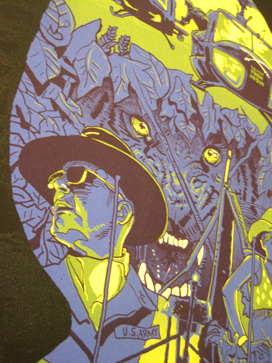
Back in Early December, I was asked to produce a print for the always-excellent-to-deal-with TommyGood.com to promote the Astor Theatre’s screening of Apocalypse Now coming up in February. The Astor is in Australia, and I’m stuck here in dumb ‘ol Austin. Sigh. My artwork goes all the cool places, and I’m here.
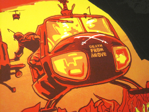
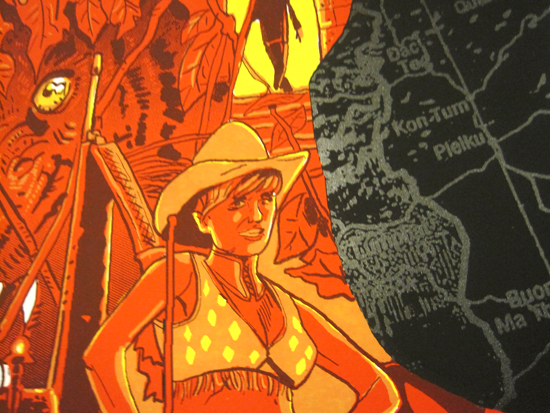
Read more ramblings of an insensitive jerk after the jump! (Detail pics, too)
As I always do before I create a print for a movie, I sit down and watch the film, no matter how familiar I am with it. I’ve must have seen Apocalypse Now a good 25 times now by this point, but even then it’d been a good 5 years since I last watched it. And holy God, it’s still great. It’s a big, beautiful, dark, disturbing, mess of a film, and I can’t get enough. The unbelievably good sound design links together the increasingly odd and unsettling set pieces. And the characters are unforgettable and iconic- the innocent Clean played by a 14 year old Larry Fishburn, Hopper’s burn-out photo journalist, and Brando’s Kurtz- a giant brute of a poet. A monster and a messiah. Coppola took himself right up to the edge during the production of this film, and I feel like the director who emerged on the other end of that journey is barely recognizable as the man who brought us The Godfather a few years earlier.
So, in a film as visually rich and diverse in location as Apocalypse Now, I didn’t feel my usual ‘pick a great scene, and reinterpret it from another angle’ that I’ve been doing lately. It’d been a while since I did what I feel is a traditional movie poster, and wanted to show that I’m not a one-trick pony. I hate working in one style all the time. I did that ‘Murray x6’ print a while back, showing that I can nail a likeness no problem, and then spent the next year or so purposefully avoiding portraiture almost entirely, focusing more on environments and setting. With this one, I wanted to throw in some likenesses, montage/collage and design, and really kick it out. A lot of artists work in one style or deal with a predictable subject matter time and time again. It can be important for branding purposes- as it makes the artist quickly recognizable. Branding, by the way, is also important for cattle.
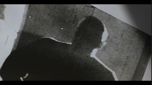
As I watched the film, I was struck by this photo that Willard holds as he’s going through Kurtz’ dossier, of him back-lit. It’s right at this point when his narration takes a dark turn, detailing the madness of Kurtz, and the score strikes a tense note. I thought of Kurtz, with all this darkness inside of him, the whole insane war he was wrapped up in, and how even though he’s barely in the film compared to it’s running time, his presence is felt through the entire journey. And then I knew I had my major design element- Kurtz encompassing the whole design with the dark map of Vietnam and Cambodia behind him.
After creating the red version, I was monkeying around in Photoshop, and was really into the blue/green combo I stumbled upon. That’s how a variant is born, kids.
The map in the background is printed in a clear varnish layer with just a HINT of silver metallic ink, to make it glisten.
The print measures 16×26, in a regular edition of 250, and a variant edition of 65. These will go on sale in early Feb. on www.TommyGood.com.
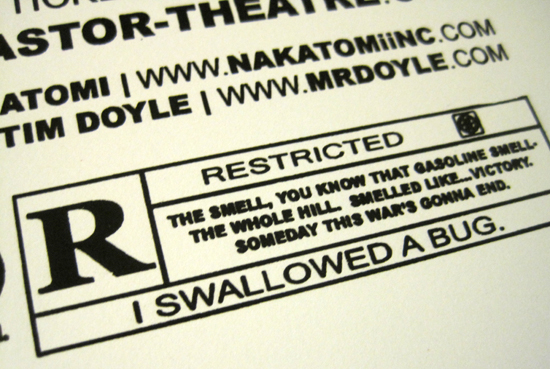
Last bonus shot-
-tim doyle

