Note- this was originally written by me for use on Slashfilm.com, and their coverage of the art show discussed below. I’m reproducing it here with permission from myself.
The fine folks over at SpokeArt.net have put together a MASSIVE art show celebrating the films of Quentin Tarantino and the Coen Bros. and they’ve asked me to participate. Since I did five prints for their previous show, a Wes Anderson tribute (called “Bad Dads”), I decided that I had to go even bigger this time around and set out to create SEVEN pieces. As hard as it was to choose, I went with doing all seven of Tarantino’s features, and leave the Coens aside for now. A heartbreaking choice, as Raising Arizona is in my top 5 desert island films- along with Pee-Wee’s Big Adventure, Robocop, Blade Runner, and Babe 2: Pig in the City. (SERIOUSLY.) But it did give me a chance to re-watch all of Quentin’s films, and see a couple for the first time. I do realize that ‘having’ to watch movies being a large part of my job is just about the craziest thing that could happen to me, but I digress.
I’ve met and talked to Tarantino several times in the past, having been a manager/ creative type person at the Alamo Drafthouse at my last job. And let me say, the guy is every bit as energetic and crazed as he appears to be in all those DVD special features. He is a fanboy in the extreme. A giant, tall, animated weirdo who will talk over and through you, and you just have to nod and hold on to the conversation for dear life. In my limited experience, he’s exhausting to be around. But, it’s that crazy passion and energy that he pours into his work and it comes screaming off the screen at you. </namedrop>
READ THE REST OF THIS CRAZY BIG ARTICLE AFTER THE JUMP!
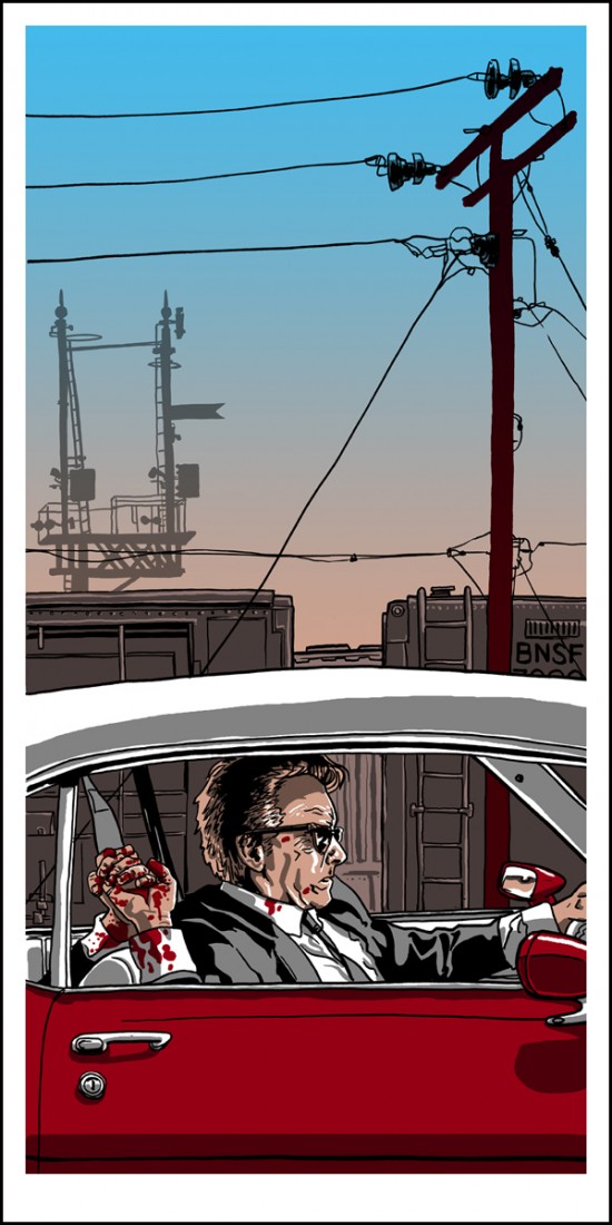
“Mr. Orange dying in a 1972 Pontiac Lemans Coupe Convertible” 12×24 first edition of 175 hand pulled silkscreen prints, signed and numbered by the artist.
I hadn’t seen Reservoir Dogs in a long time, probably since it was first released on video, and I was really blown away by how freaking tight the film is. Compared to the expansivness of Kill Bill or the rambling nature of Death Proof, Dogs pretty much happens entirely in a small room, with some creative use of flashbacks to build tension, inform characters, and pull the goddamn rug out from underneath you. It’s brilliant. It’s also from 1992 which means I’m old and I’m going to die any day now. I was also surprised by how violent it WASN’T. Oh, don’t get me wrong- horrible things happen to people in this film, but it’s almost completely all off-camera.
For me, the whole film is about the bond these two characters form- Mr. White and Mr. Orange. The entire caper, and all the character’s lives come undone because of the tight honor-bond that White has with Orange. Orange took a bullet in the gut and White is going to see him saved come hell or high water. It’s in this car that the seeds of destruction are sown, a pact made in a bloody hand-clasp. And damn, what a car it is. It’s a big honking chunk of US steel, and while it’s not out of place in the film stylistically, it’s a definite conscious decision on the part of the filmmakers.
I wanted to capture the thick, hazy sky of LA in this piece, as White and Orange drive past the train yard. I hadn’t attempted a split-fountain blend like this before, and was really pleased with how it turned out. I’m also a big fan of all the completely unexplainable ‘city / industrial junk’ that populates our lives, like the telephone pole and whatever the hell that other thing is in the background there. These objects are always around us, but we’re never really cognizant of them. They’re otherworldly and commonplace at the same time.
While I did watch all the movies in order for prepping on this project, I created these prints in order of when the ideas came to me. Next up is the Kill Bill 2. I hadn’t seen the Kill Bill films since they were in cinemas (at the late, lamented Dobie Theater here in Austin) and it was fantastic to revisit them. They really are a film-lover’s dream. There’s so many flavors smashed in together, but instead of overwhelming the palette, they blend sublimely. Like a really good burrito. Hmm. I apologize, I’ve not yet eaten lunch.
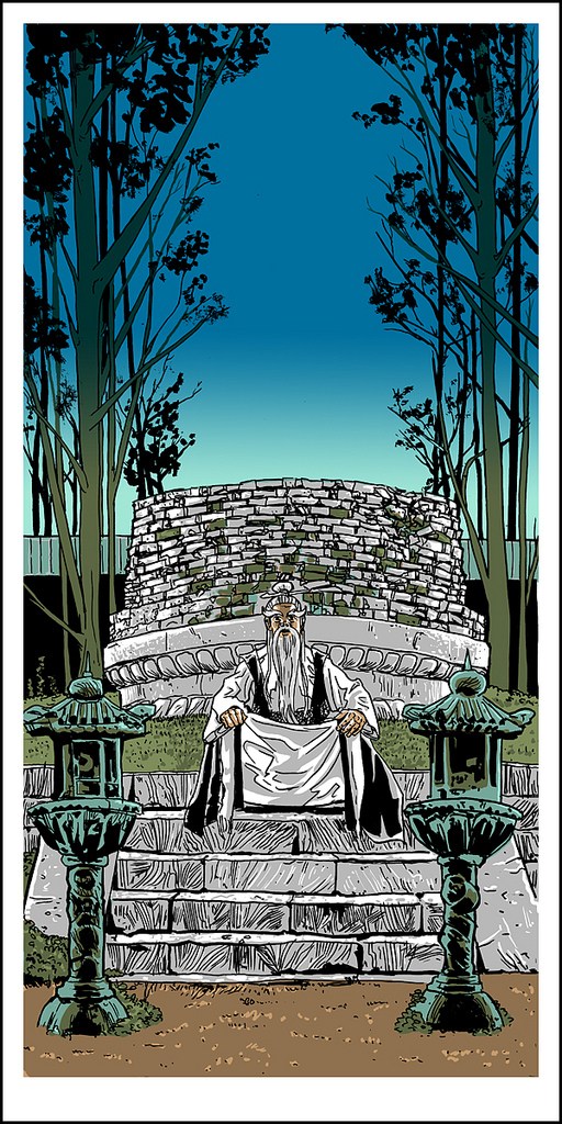
“Pai Mei Awaits” 12×24 edition of 175, hand pulled silkscreen print, signed and numbered by the artist.
In the film, when the Bride ascends the staircase to Pai Mei’s mountaintop home, and we get our first look at Pai Mei- I knew we had just shifted gears into a new genre. While the ‘House of Blue Leaves’ bit from part 1 had been a Japanese / Yakuza send-up, this was clearly going to be a Chinese-style Shaw Bros. influenced training segment, and I couldn’t have been happier. I spent several Sunday afternoons in my youth watching badly dubbed Kung-Fu epics on UHF 27 in Dallas, and Pai Mei was a recurring character in a lot of those films. This was truly a brilliant choice by a very smart nerd- Tarantino does not disappoint.
This print has the least amount of screens used out of the series, only 4. But it’s all the transparencies and overlays with the ink that gives it a wide range of color. The split fountain in the sky is printed over top of the brown in the trees, giving it some atmospheric perspective and some real depth. This was my first time trying a transparent split like that, and I’m really happy with the result. Like all split fountains, the printer is blending colors on the screen itself, so each one is a little different.
“The Swan Song of Oren-Ishii” 12×24 edition of 175, hand pulled silkscreen print, signed and numbered by the artist.
I looped back and did Kill Bill 1 next. As tempting as it was to depict the actual sword battle between the Bride and the Crazy 88’s or the Bride and Oren, I found this scene to be the most engaging. The transition from the frantic and violent and completely unrealistic (and completely awesome) swordfight inside the House of Blue Leaves to this exterior snow scene is probably my favorite segment in the film. It felt like Dorothy exiting her house into OZ- the stillness and peace and change right then is palpable, almost tactile. The viewer knows that no matter what’s just happened, this is something new.
The soft fade in the blue-black sky was an effect I wanted to make sure I got perfectly from the film, as it really captures the mood I wanted to convey in this piece. And the addition of the falling snow turns what would have been a very static image into a living and moving thing. It’s a trick I first picked up when doing the ‘White Dragon’ Blade Runner tribute piece a while back- an atmospheric effect like that can really help bring a piece alive.
“A 1971 Chevy Nova Making Love to a 1996 Honda Civic” 12×24 edition of 175, signed and numbered by the artist.
The next print I tackled was Death Proof. I had actually never seen Death Proof (or Planet Terror for that matter), so I was definitely interested in finally watching the thing. The first segment in Death Proof was made in Austin where I live, and while I was working at an Iron-On t-shirt shop there, the costume department had come in and bought quite a few shirts to use on screen- most notably the bootleg Tura Satana shirt worn by the ‘Shanna’ character. And yes, the already super-small ladies small American Apparel cap-sleeve t-shirt that was worn on camera had to be taken in and made smaller still for the actress. Which leads me to believe that all Hollywood actresses have never heard of hamburgers. But I digest.
Death Proof is not my favorite of Tarantino’s films, but having seen my share (and your share, and probably the next 10 people’s share) of Grindhouse films, I knew what he was shooting for, and I appreciate the intent, at least. HOWEVER- the film has one hum-dinger of a car accident. It’s really a masterstroke of practical effects and sheer violence. Obviously in the film there’s the undercurrent of Stuntman Mike’s car-crash proclivities being a metaphorical (and possibly actual) sexual release, but I also think there’s another level in that these big old American cars can really wreck house on the smaller, crappier modern cars. Mike’s Nova totally disassembles the Civic in the first half, and it isn’t until the girls in the second half get their hands on a Challenger are they a match for Mike. In fact- in the big car chase at the end, all the modern plastic vehicles are merely obstacles to be overcome in this epic muscle-car duel. (Please note, I drive a 2007 Prius…sigh.)
Anyone familiar with my work knows that I absolutely LOVE the work of Geoff Darrow, and the way he handles movement and chaos and destruction all with an incredible eye to detail. And his love for BIG old American cars comes screaming off the page of all his comics. Heck, Big Guy (From Darrow’s “Big Guy and Rusty the Boy Robot”) looks like a 57 Chevy decided to stand up and start fighting Kaiju. This piece is in many ways just as inspired by Darrow’s cover to Hard Boiled #1 as it is by Death Proof. I rarely go super-gory with my stuff, but Jungle Julia’s severed leg’s arterial spray and it’s subsequent bouncing off the pavement like slow-mo Jello said ‘draw this’ to me. Of course, it might have been having to suffer through almost an hour of inane, poseur girl-talk that made me rejoice in their complete on-camera evisceration. On further reflection, it might be sentences like the two previous that made my middle-school English teacher suggest I needed counseling. Moving on-
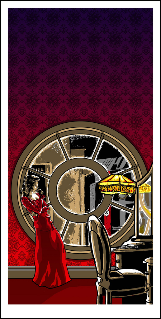
“Putting out the Fire With Gasoline” 12×24 edition of 175 signed and numbered by the artist.
Inglorious Basterds was another film that I hadn’t seen before starting this project, and let me say- I wish I saw it in the theater. It’s without a doubt QT’s best. Pulp Fiction and Kill Bill might be more FUN, but IG is a better film. The acting, the music choices, the casting…just as perfect a film as you could ask for. Like a lot of my Wes Anderson prints for Spokeart.net, this one was inspired by the music choice for the scene depicted. Bowie’s “Cat People” might seem a little out of place for a WW2 period piece, but it just perfectly captures and enhances the feeling of finality and determination of the Shoshanna character. Her arc is really the driving one for the film- Inglorious Basterds is Shoshanna’s story. In fact, as much as I enjoyed watching the Basterds blaze a bloody trail across France, their involvement in the story is completely incidental to the outcome. Shoshanna was going to burn every single one of those Nazi scumbags alive in her theater- the Basterds just happened to be there that night as well.
This print is the one that I did completely digitally- all the others were hand-drawn. I wanted to make sure I got the tie-fighter-esque window perfectly, and I wanted to be able to noodle around with the composition as much as possible to get it perfect. Also, hiding a ‘secret swastika’ in wall paper patterns is what Photoshop was made for. (Now, THAT is my favorite insane sentence.) Like my Godfather prints from a couple of years ago, I wanted this print to be what would appear as a ‘pretty picture’ at a glance, and then you notice a bit of hidden menace- the Nazi flag in through the window, and the gun on the table.
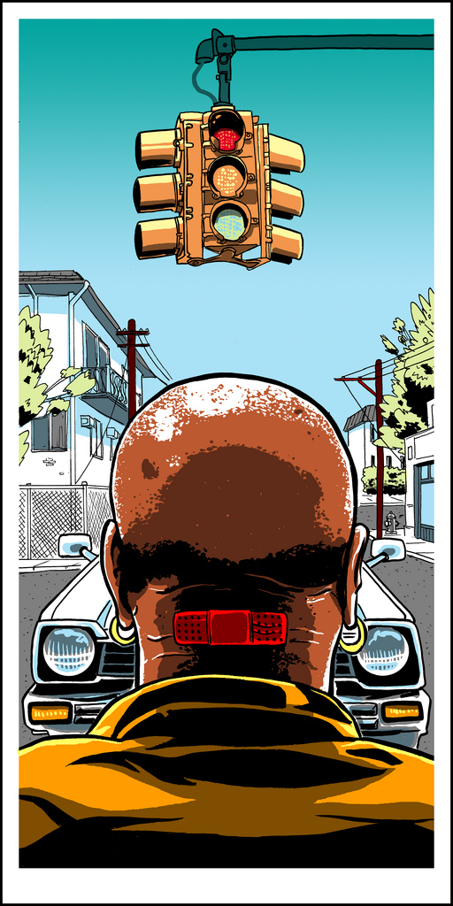
“Marcellus Wallace Becomes Acquainted With a 1980 Honda Civic Hatchback” 12×24 edition of 175, signed and numbered by the artist.
Even though I watched all of QT’s films in order working on this project, I saved Pulp Fiction for almost last, as I was really stuck on what to do for it. Not because I didn’t have any ideas- it was because I had TOO MANY ideas. Pulp Fiction is a collection of just killer moments on top of moments. Pulp Fiction came out when I was a senior in High School, and among my group of friends, it hit like a pop-culture A-bomb. The film changed the way we talked and interacted and helped inform the people we were- from what we thought was cool, to how we dressed. In short- it really fucked our shit up. And that was a good thing. Pulp Fiction was the antidote for a Summer that included the treacly, overly sentimental Forrest Gump. From the structure, to the style, to the music, it hit Hollywood where it counted and spawned a legion of imitators.
For me, the scene where Marsellus is about to get plowed under by Butch’s Civic is pure comedy genius. Butch had just come out of what is probably the 2nd most tense scene in the film, and we’ve had the death of Vic Vega to process. And we all breathed a sigh of relief. He’s got his watch, he’s on his way out of town, and ‘Flowers on the Wall’ is playing on the radio. Everything is great. And then Marsellus walks onto the scene and with a simple ‘Muther-Fucker’ the whole film take a left turn into crazy town culminating in Butch going samurai on Zed and Co. Up until this point, all we’d seen of Marsellus was the back of his head and that mysterious iconic Band-Aid; an image I wanted to echo here.
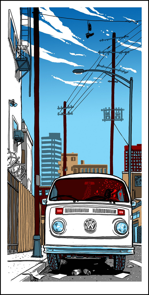
“Louis Gara Meets His End in a 1973 Volkswagen Bus” 12×24 edition of 175, signed and numbered by the artist.
I had to save Jackie Brown for last, as I really struggled with this one. I like the movie a lot- but it’s probably the least ‘Tarantino’ of all of QT’s movies. It’s slow and quiet and subtle in a way none of his other films are. The film isn’t as much as a visual feast as his other works either (unless you count the stunning vistas of Pam Grier…yowza!) Which fits the story just fine- a hyper stylized, jump cut type flick would’ve steamrolled the script and acting. I’ve been sneaking VW Mini-buses into my work for years now, from my comic ‘Sally Suckerpunch’ back in 2001, through my recent ‘King Crab’ print- so the opportunity to do the same with this series was too much to resist. Ordell shooting Louis in the front seat is just a great moment- the disgust on Jackson’s face at how far Louis had fallen from his former self, and the casual nature with which he blows him away speaks volumes about the character. (Almost as much as his completely disgusting beard/soul patch thing does.) Again, much like my “Full of Grace” Godfather 2 print, this would be just a nice picture at first glance. In some ways, this print is my favorite of the bunch- it took me the longest to come up with an idea for, and I got to throw in ‘city junk’ and a VW bus- color me happy.
All these prints (including a wood variant edition of 7 of each print) will be available for sale at the gallery opening in NYC and online shortly thereafter.
Thank you,
Tim Doyle.


